Case Study: Combining Cutting-Edge CSS Features Into a âCourse Navigationâ Component
I came across this awesome article navigator by Jhey Tompkins:
It solved a UX problem I was facing on a project, so Iâve adapted it to the needs of an online course â a âcourse navigatorâ if you will â and built upon it. And today Iâm going to pick it apart and show you how it all works:
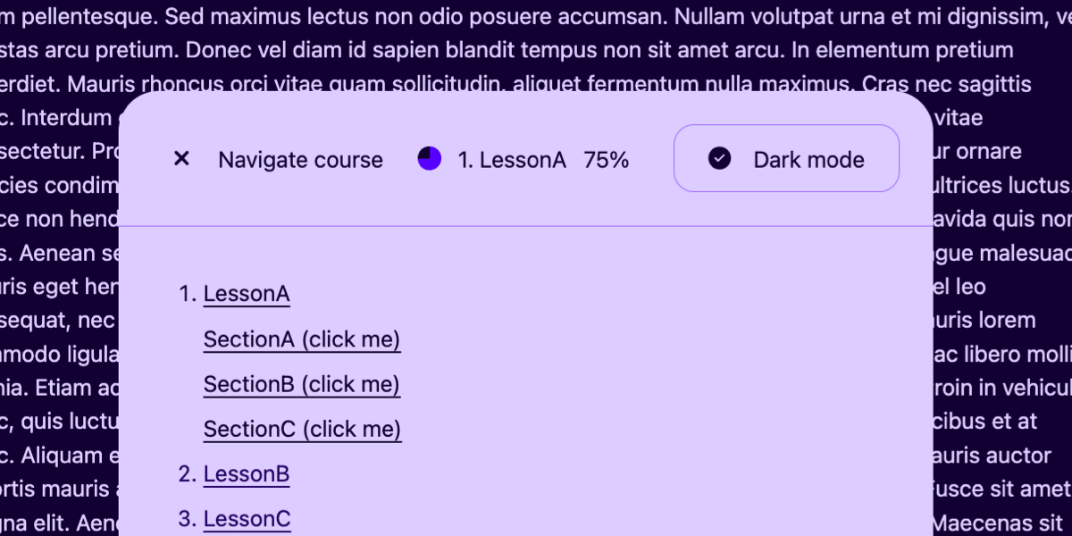
You can see Iâm imagining this as some sort of navigation that you might find in an online learning management system that powers an online course. To summarize what this component does, it:
- links to all course lessons,
- smoothly scrolls to anchored lesson headings,
- indicates how much of the current lesson has been read,
- toggles between light and dark modes, and
- sits fixed at the bottom and collapses on scroll.
Also, while not a feature, we wonât be using JavaScript. You might think thatâs impossible, but the spate of CSS features that have recently shipped make all of this possible with vanilla CSS, albeit using bleeding-edge techniques that are only fully supported by Chrome at the time Iâm writing this. So, crack open the latest version and letâs do this together!
The HTML
Weâre looking at a disclosure widget (the <details> element) pinned to the bottom of the page with fixed positioning. Behind it? A course lesson (or something of that effect) wrapped in an <article> with ids on the headings for same-page anchoring. Clicking on the disclosureâs <summary> toggles the course navigation, which is wrapped in a ::details-content pseudo-element. This navigation links to other lessons but also scrolls to the aforementioned headings of the current lesson.
The <summary> contains a label (since it functions as a toggle-disclosure button), the name of the current lesson, the distance scrolled, and a dark mode toggle.
With me so far?
<details>
<!-- The toggle (flex â) -->
<summary>
<span><!-- Toggle label --></span>
<span><!-- Current lesson + % read --></span>
<label><!-- Light/dark-mode toggle --></label>
</summary>
<!-- ::details-content -->
<!-- Course navigation -->
<!-- /::details-content -->
</details>
<article>
<h1 id="sectionA">Section A</h1>
<p>...</p>
<h2 id="sectionB">Section B</h2>
<p>...</p>
<h2 id="sectionC">Section C</h2>
<p>...</p>
</article>Getting into position
First, weâll place the disclosure with fixed positioning so that itâs pinned to the bottom of the page:
details {
  position: fixed;
  inset: 24px; /* Use as margin */
  place-self: end center; /* y x */
}
Setting up CSS-only dark mode (the new way)
There are certain scenarios where dark mode is better for accessibility, especially for the legibility of long-form content, so letâs set that up.
First, the HTML. We have an ugly checkbox input thatâs hidden thanks to its hidden attribute, followed by an <i> whichâll be a better-looking faux checkbox once weâve sprinkled on some Font Awesome, followed by a <span> for the checkboxâs text label. All of this is then wrapped in an actual <label>, which is wrapped by the <summary>. We wrap the labelâs content in a <span> so that flexbox gaps get applied between everything.
Functionally, even though the checkbox is hidden, it toggles whenever its label is clicked. And on that note, it might be a good idea to place an explicit aria-label on this label, just to be 100% sure that screen readers announce a label, since implicit labels donât always get picked up.
<details>

  <summary>

    <!-- ... -->

    <label aria-label="Dark mode">
      <input type="checkbox" hidden>
      <i></i>
      <span>Dark mode</span>
    </label>

  </summary>

  <!-- ... -->

</details>
Next we need to put the right icons in there, subject to a little conditional logic. Rather than use Font Awesomeâs HTML classes and have to mess around with CSS overwrites, weâll use Font Awesomeâs CSS properties with our rule logic, as follows:
If the <i> element is followed by (notice the next-sibling combinator) a checked checkbox, weâll display a checked checkbox icon in it. If itâs followed by an unchecked checkbox, weâll display an unchecked checkbox icon in it. Itâs still the same rule logic even if you donât use Font Awesome.
/* Copied from Font Awesomeâs CSS */
i::before {
font-style: normal;
font-family: "Font Awesome 6 Free";
display: inline-block;
width: 1.25em; /* Prevents content shift when swapping to differently sized icons by making them all have the same width (this is equivalent to Font Awesomeâs .fa-fw class) */
}
/* If followed by a checked checkbox... */
input[type=checkbox]:checked + i::before {
content: "\f058";
font-weight: 900;
}
/* If followed by an unchecked checkbox... */
input[type=checkbox]:not(:checked) + i::before {
content: "\f111";
font-weight: 400;
}We need to implement the modes at the root level (again, using a little conditional logic). If the root :has the checked checkbox, apply color-scheme: dark. If the root does :not(:has) the unchecked checkbox, then we apply color-scheme: light.
/* If the root has a checked checkbox... */
:root:has(input[type=checkbox]:checked) {
  color-scheme: dark;
}

/* If the root does not have a checked checkbox... */
:root:not(:has(input[type=checkbox]:checked)) {
  color-scheme: light;
}
If you toggle the checkbox, your web browserâs UI will already toggle between light and dark color schemes. Now letâs make sure that our demo does the same thing using the light-dark() CSS function, which takes two values â the light mode color and then the dark mode color. You can utilize this function instead of any color data type (later on weâll even use it within a conic gradient).
In the demo Iâm using the same HSL color throughout but with different lightness values, then flipping the lightness values based on the mode:
color: light-dark(hsl(var(--hs) 90%), hsl(var(--hs) 10%));
background: light-dark(hsl(var(--hs) 10%), hsl(var(--hs) 90%));
I donât think the light-dark() function is any better than swapping out CSS variables, but I donât believe itâs any worse either. Totally up to you as far as which approach you choose.
Displaying scroll progress
Now letâs display the amount read as defined by the scroll progress, first, as what I like to call a âprogress pieâ and then, second, as a plain-text percentage. Theseâll go in the middle part of the <summary>:
<details>

  <summary>

    <!-- ... -->

    <span>
      <span id="progress-pie"></span>
      <span>1. LessonA</span>
      <span id="progress-percentage"></span>
    </span>

    <!-- ... -->

  </summary>

  <!-- ... -->

</details>
What we need is to display the percentage and allow it to âcountâ as the scroll position changes. Normally, this is squarely in JavaScript territory. But now that we can define our own custom properties, we can establish a variable called --percentage that is formatted as an integer that defaults to a value of 0. This provides CSS with the context it needs to read and interpolate the value between 0 and 100, which is the maximum value we want to support.
So, first, we define the variable as a custom property:
@property --percentage {
  syntax: "<integer>";
  inherits: true;
  initial-value: 0;
}
Then we define the animation in keyframes so that the value of --percentage is updated from 0 to 100:
@keyframes updatePercentage {
  to {
    --percentage: 100;
  }
}
And, finally, we apply the animation on the root element:
:root {
  animation: updatePercentage;
  animation-timeline: scroll();
  counter-reset: percentage var(--percentage);
}
Notice what weâre doing here: this is a scroll-driven animation! By setting the animation-timeline to scroll(), weâre no longer running the animation based on the documentâs timeline but instead based on the userâs scroll position. You can dig deeper into scroll timelines in the CSS-Tricks Almanac.
Since weâre dealing with an integer, we can target the ::before pseudo-element and place the percentage value inside of it using the content property and a little counter() hacking (followed by the percentage symbol):
#progress-percentage::before {
  content: counter(percentage) "%";
  min-width: 40px; display: inline-block; /* Prevents content shift */
}
The progress pie is just as straightforward. Itâs a conic gradient made up of two colors that are positioned using 0% and the scroll percentage! This means that youâll need that --percentage variable as an actual percentage, but you can convert it into such by multiplying it by 1% (calc(var(--percentage) * 1%))!
#progress-pie {
  aspect-ratio: 1;
  background: conic-gradient(hsl(var(--hs) 50%) calc(var(--percentage) * 1%), light-dark(hsl(var(--hs) 90%), hsl(var(--hs) 10%)) 0%);
  border-radius: 50%; /* Make it a circle */
  width: 17px; /* Same dimensions as the icons */
}
Creating a (good) course navigation
Now for the table contents containing the nested lists of lesson sections within them, starting with some resets. While there are more resets in the demo and more lines of code overall, two specific resets are vital to the UX of this component.
First, hereâs an example of how the nested lists are marked up:
<details>

  <summary>
    <!-- ... -->
  </summary>

  <ol>
    <li class="active">
      <a>LessonA</a>
      <ol>
        <li><a href="#sectionA">SectionA</a></li>
        <li><a href="#sectionB">SectionB</a></li>
        <li><a href="#sectionC">SectionC</a></li>
      </ol>
    </li>
    <li><a>LessonB</a></li>
    <li><a>LessonC</a></li>
  </ol>

</details>Letâs reset the list spacing in CSS:
ol {
  padding-left: 0;
  list-style-position: inside;
}
padding-left: 0 ensures that the parent list and all nested lists snap to the left side of the disclosure, minus any padding you might want to add. Donât worry about the indentation of nested lists â we have something planned for those. list-style-position: inside ensures that the list markers snap to the side, rather than the text, causing the markers to overflow.
After that, we slap color: transparent on the ::markers of nested <li> elements since we donât need the lesson section titles to be numbered. Weâre only using nested lists for semantics, and nested numbered lists specifically because a different type of list marker (e.g., bullets) would cause vertical misalignment between the courseâs lesson titles and the lesson section titles.
ol ol li::marker {
  color: transparent;
}
Finally, so that users can more easily traverse the current lesson, weâll dim all list items that arenât related to the current lesson. Itâs a form of emphasizing something by de-emphasizing others:
details {
/* The default color */
color: light-dark(hsl(var(--hs) 90%), hsl(var(--hs) 10%));
}
/* <li>s without .active thatâre direct descendants of the parent <ol> */
ol:has(ol) > li:not(.active) {
/* A less intense color */
color: light-dark(hsl(var(--hs) 80%), hsl(var(--hs) 20%));
}
/* Also */
a {
color: inherit;
}One more thing⦠those anchor links scroll users to specific headings, right? So, putting scroll-behavior: smooth on the root to enables smooth scrolling between them. And that percentage-read tracker that we created? Yep, thatâll work here as well.
:root {
  scroll-behavior: smooth; /* Smooth anchor scrolling */
  scroll-padding-top: 20px; /* A scroll offset, basically */
}
Transitioning the disclosure
Next, letâs transition the opening and closing of the ::details-content pseudo-element. By default, the <details> element snaps open and closed when clicked, but we want a smooth transition instead. Geoff recently detailed how to do this in a comprehensive set of notes about the <details> element, but weâll break it down together.
First, weâll transition from height: 0 to height: auto. This is a brand-new feature in CSS! We start by âopting intoâ the feature at the root level with interpolate-size: allow-keywords`:
:root {
  interpolate-size: allow-keywords;
}
I recommend setting overflow-y: clip on details::details-content to prevent the content from overflowing the disclosure as it transitions in and out:
details::details-content {
  overflow-y: clip;
}
Another option is sliding the content out and then fading it in (and vice-versa), but youâll need to be quite specific about the transitionâs setup.
First, for the âbeforeâ and âafterâ states, youâll need to target both details[open] and details:not([open]), because vaguely targeting details and then overwriting the transitioning styles with details[open] doesnât allow us to reverse the transition.
After that, slap the same transition on both but with different values for the transition delays so that the fade happens after when opening but before when closing.
Finally, youâll also need to specify which properties are transitioned. We could simply put the all keyword in there, but that is neither performant nor allows us to set the transition durations and delays for each property. So weâll list them individually instead in a comma-separated list. Notice that weâre specifically transitioning the content-visibility and using the allow-discrete keyword because it is a discrete property. this is why we opted into interpolate-size: allow-keywords earlier.
details:not([open])::details-content {
  height: 0;
  opacity: 0;
  padding: 0 42px;
  filter: blur(10px);
  border-top: 0 solid light-dark(hsl(var(--hs) 30%), hsl(var(--hs) 70%));
  transition:
    height 300ms 300ms,
    padding-top 300ms 300ms,
    padding-bottom 300ms 300ms,
    content-visibility 300ms 300ms allow-discrete,
    filter 300ms 0ms,
    opacity 300ms 0ms;
}

details[open]::details-content {
  height: auto;
  opacity: 1;
  padding: 42px;
  filter: blur(0);
  border-top: 1px solid light-dark(hsl(var(--hs) 30%), hsl(var(--hs) 70%));
  transition:
    height 300ms 0ms,
    padding-top 300ms 0ms,
    padding-bottom 300ms 0ms,
    content-visibility 300ms 0ms allow-discrete,
    filter 300ms 300ms,
    opacity 300ms 300ms;
}
Giving the summary a label and icons
Preceding the current lessonâs title, percentage read, and dark mode toggle, the <summary> element needs a label that helps describe what it does. I went with âNavigate courseâ and included an aria-label saying the same thing so that screen readers didnât announce all that other stuff.
<details>
  <summary aria-label="Navigate course">
    <span>
      <i></i>
      <span>Navigate course</span>
    </span>

    <!-- ... -->

  </summary>

  <!-- ... -->
</details>
In addition, the summary gets display: flex so that we can easily separate the three sections with a gap, which also removes the summaryâs default marker, allowing you to use your own. (Again, Iâm using Font Awesome in the demo.)
i::before {
  width: 1.25em;
  font-style: normal;
  display: inline-block;
  font-family: "Font Awesome 6 Free";
}

details i::before {
  content: "\f0cb"; /* fa-list-ol */
}

details[open] i::before {
  content: "\f00d"; /* fa-xmark */
}


/* For older Safari */
summary::-webkit-details-marker {
   display: none;
}
And finally, if youâre pro-cursor: pointer for most interactive elements, youâll want to use it on the summary and manually make sure that the checkboxâs label inherits it, as it doesnât do that automatically.
summary {
  cursor: pointer;
}

label {
  cursor: inherit;
}
Giving the disclosure an auto-closure mechanism
A tiny bit of JavaScript couldnât hurt though, could it? I know I said this is a no-JavaScript deal, but this one-liner will automatically close the disclosure when the mouse leaves it:
document.querySelector("details").addEventListener("mouseleave", e => e.target.removeAttribute("open"));Annoying or useful? Iâll let you decide.
Setting the preferred color scheme automatically
Setting the preferred color scheme automatically is certainly useful, but if you like to avoid JavaScript wherever possible, I donât think users will be too mad for not offering this feature. Either way, the following conditional snippet checks if the userâs preferred color scheme is âdarkâ by evaluating the relevant CSS media query (prefers-color-scheme: dark) using window.matchMedia and matches. If the condition is met, the checkbox gets checked, and then the CSS handles the rest.
if (window.matchMedia("prefers-color-scheme: dark").matches) {
  document.querySelector("input[type=checkbox]").checked = true;
}
Recap
This has been fun! Itâs such a blessing we can combine all of these cutting-edge CSS features, not just into one project but into a single component. To summarize, that includes:
- a course navigator that shows the current lesson, all other lessons, and smooth scrolls between the different headings,
- a percentage-scrolled tracker that shows the amount read in plain text and as a conic gradient⦠pie chart,
- a light/dark-mode toggle (with some optional JavaScript that detects the preferred color scheme), and it is
- all packed into a single, floating, animated, native disclosure component.
The newer CSS features we covered in the process:
- Scroll-driven animations
interpolate-size: allow-keywordsfor transitioning between0andauto- smooth scrolling by way of
scroll-behavior: smooth - dark mode magic using the
light-dark()function - a progress chart made with a
conic-gradient() - styling the
::details-contentpseudo-element - animating the
<details>element
Thanks to Jhey for the inspiration! If youâre not following Jhey on Bluesky or X, youâre missing out. You can also see his work on CodePen, some of which he has talked about right here on CSS-Tricks.